Pixel’s At a Glance just got easier to read, and I can finally use my favorite wallpaper
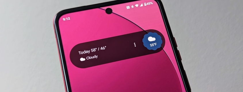
Google’s At a Glance widget is finally getting the glow-up it desperately needed — and it’s about time. If you’ve ever squinted at your Pixel’s home screen trying to read weather alerts or calendar events against a busy wallpaper, you’re not alone. Google is rolling out a new high-contrast mode that introduces a sleek, semi-transparent, pill-shaped background behind the widget’s text, making it easier to read no matter what your wallpaper looks like.
For years, the At a Glance widget has been a staple of the Pixel experience, offering proactive, helpful information right on your home and lock screens. But its Achilles’ heel has always been legibility. Bright, patterned, or cluttered backgrounds often made the text blend in, turning a useful feature into a frustrating guessing game. Now, Google is addressing this head-on with a simple yet effective solution.
The new high-contrast mode is activated with a single toggle in the widget’s settings. Once enabled, a translucent dark background appears behind the text, spanning the full width of the widget and featuring softly rounded corners. This background supports both black and white text, ensuring readability whether you’re on your home screen or glancing at your lock screen.
Early reports from users, including those in Germany, suggest the update is rolling out gradually via a server-side update. Interestingly, the feature seems to be available to users running Android 16 QPR3 Beta, but it’s likely tied to a Google app update or a server flag rather than the beta OS itself. This suggests Google is taking a cautious, phased approach to ensure the feature works smoothly across devices.
The update has been a long time coming. Google first hinted at this fix during a code teardown in 2025, and now, over a year later, it’s finally reaching users. This delay underscores just how much the Pixel community has been clamoring for a solution to this persistent issue.
From a design perspective, the new mode strikes a perfect balance between subtlety and functionality. It doesn’t force you to abandon your favorite wallpapers or compromise your personal style. Instead, it quietly enhances usability, making it easier to stay informed without extra effort.
This isn’t a flashy, headline-grabbing feature, but it’s exactly the kind of thoughtful improvement that makes a real difference in daily phone use. After all, the best technology is the kind that just works — and now, At a Glance finally does.
Tags: Google, Pixel, At a Glance, widget, high-contrast mode, Android 16, QPR3 Beta, legibility, home screen, lock screen, wallpaper, usability, Pixel experience, tech update, Google app, server-side rollout.
Viral Phrases: “Finally fixing what was broken,” “The glow-up your Pixel needed,” “No more squinting at your screen,” “A small change, a big win,” “Google listens to its users,” “The widget that actually works now,” “Pixel’s best-kept secret just got better,” “Say goodbye to unreadable alerts,” “The future of Pixel is here,” “Google’s quiet revolution in usability.”
,


Leave a Reply
Want to join the discussion?Feel free to contribute!